Cand-EL
Ambient Energy Device
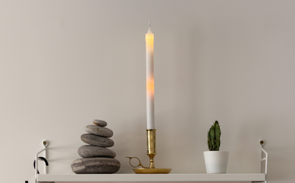
A candle-shaped device that makes household electricity use visible, so people can understand their consumption at any moment, without apps, numbers, or guilt.
Most energy tools show data on screens and expect people to interpret it. Our research found that this creates stress and guilt instead of awareness. Cand-EL takes the opposite approach: a familiar physical object in the home, glowing gently with the rhythm of consumption, asking for attention only when you choose to give it.
Role
Product Designer
Duration
10 weeks
Team
5 designers
Tools
Figma · Arduino · Sketch · Miro · Paper Prototyping
Responsibilities
UX Research · User Interviews · Design Ideation · Usability Testing · Interaction Design
Result & Impact
The final design took shape over three iterations, each refined by user feedback: from multi-color signals to a single orange flame with a slow, breathing light. The last round was a one-day usability test in participants' homes, with two participants per household who had used earlier prototypes. The outcomes below are what that testing showed. The final prototype was a physical, candle-sized object with the flame rendered in light. It was not connected to live electricity data; typical usage patterns were manually recreated to focus on perception and emotional response rather than technical accuracy.
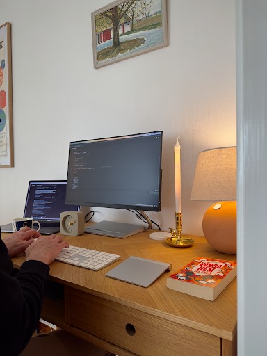
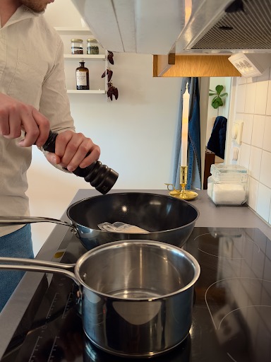
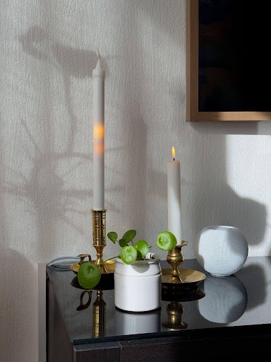
It settles quietly into daily life, calm and easy to live with.
- Replaced color-based signals with a single orange flame and a slow, breathing light animation
- Made brightness and gentle movement of the glow the only feedback, rising and falling with consumption
- Kept changes slow and steady, encouraging reflection rather than immediate reaction
- Chose a physical, always-visible object instead of an app, so anyone in the household can see and discuss usage
Clarity
Understanding of the light feedback improved consistently across all three iterations.
Calm
Participants found the candle calm, subtle, and easy to understand, responding positively to its non-judgmental nature.
Mindfulness
Some participants reported feeling more mindful and less stressed when thinking about their electricity use.
The test also surfaced useful criticism: a few participants noted that occasional light changes were subtle enough to miss, and one felt the candle was slightly decorative at times, though still a gentle reminder of energy use. Another suggested raising brightness during peak hours, a change we would test in the next iteration.
The Problem
User research uncovered why existing energy tools fail people. The most critical:
- Technical units like kWh made little sense to most users, making consumption hard to grasp
- Cost-focused feedback produced guilt and stress instead of motivation
- Screen-based tools demanded active attention, so checking them never became part of daily routines
- In shared households, responsibility for monitoring was unclear and uneven
- Users had no way to reflect on their habits without feeling judged
The real challenge was not making information visible. It was making it feel relevant and safe enough to act on.
Discover
We started with desk research on existing energy tools, ran contextual interviews and observations with 8 participants, and reviewed 6 energy monitoring products in a competitive analysis. The findings fit together: the data formats were failing people, and what people wanted instead was calm, ambient feedback.
The direction came straight from the interviews: people wanted feedback that fits into daily life without demanding attention. That ruled out screens, apps, and alerts before a single sketch was drawn.
Every tool we reviewed was competing for attention. Our research showed people wanted the opposite: something present in the room that never demands a thing. That is what convinced me the answer was not another screen.
Desk research showed that most existing tools present electricity in technical units like kWh or cost, formats many users find hard to understand and emotionally uncomfortable, with cost-focused feedback often producing guilt instead of motivation. To understand what people actually wanted, we ran contextual interviews and observations with 8 participants, watching how energy information enters daily life.
Key findings:
- Most participants showed little interest in comparing their consumption with other households
- Appliance-level breakdowns were not wanted; people already had a general sense of which devices used the most power
- Nearly all preferred subtle, ambient feedback such as light or warmth over alerts and notifications
- Participants consistently favored information that fits into daily life without requiring active attention
The pattern was consistent across sessions: calm, ambient feedback over anything that demanded attention or felt judgmental. It set the direction for everything that followed.
We reviewed six electricity monitoring tools, Efergy, Smart Energy GB, Sense, Emporia Vue, Smappee, and Loop, to understand how they present information and engage users. Most rely on screen-based interfaces like mobile apps or dashboards, with over 80% using kWh or cost-based metrics, the exact formats our research showed people struggle to connect with. These systems typically require active involvement: logging in, opening an app, interpreting charts.
Few offer ambient or emotionally meaningful feedback. Sensory approaches were rare, and many tools lean heavily on financial tracking, which users often perceived as impersonal or guilt-inducing.
This highlighted a clear opportunity: an emotionally intelligent, physical interface that passively reflects electricity use through intuitive, sensory feedback, supporting everyday awareness without demanding attention or creating stress.
Define
We brought the research together to define what the design actually had to solve. An affinity diagram organized the findings into four themes, and from those we wrote How Might We questions and problem statements to guide the design without jumping straight to solutions.
The whole brief fit in one line: make electricity feel personal and calm, in a home everyone shares.
The strongest finding was emotional, not technical: guilt makes people look away. So before anything else, whatever we designed had to feel safe to look at.
After bringing together insights from interviews and observations, we organized the research data into an affinity diagram to identify patterns and recurring themes. Key quotes, behaviors, and reactions were grouped by similarity and emotional tone. In this process, I focused particularly on mapping emotional responses, and I noticed how strongly guilt and stress appeared as barriers to engagement. That observation shaped the problem statements that followed.
This process revealed four main themes:
- Perception of Electricity: users often described electricity as invisible and difficult to grasp, making it hard to relate daily actions to actual consumption
- Emotional Response to Monitoring: many users experienced stress, guilt, or disengagement when monitoring tools felt too direct, judgmental, or focused on cost
- Shared Responsibility: in multi-person households, electricity use was seen as a collective outcome, yet responsibility for monitoring and reflection was often unclear or uneven
- Data Relevance and Preference: users preferred high-level, contextual feedback that fit naturally into their routines, rather than detailed, technical, or comparative data
Based on our research themes, we created How Might We questions to explore design opportunities without jumping straight to solutions. These questions focused on making electricity consumption tangible, emotionally neutral, and naturally part of daily routines.
We explored questions such as:
- How might we make electricity usage visible in everyday routines?
- How might we provide feedback that feels personal and non-judgmental?
- How might we support shared households in distributing responsibility?
From these questions, we defined clear problem statements to guide our design:
- Users struggle to understand electricity usage because it is intangible and lacks direct feedback
- Current monitoring tools are too technical or focus on costs in ways that make users feel stressed or guilty, reducing long-term engagement
- In shared households, electricity use is a collective outcome, but it is often unclear who is responsible for tracking and managing it
- Users want feedback tied to their own routines, rather than abstract numbers or comparisons with others
Develop
With the problem statements in place, we explored how a physical object could carry the feedback. The concept became a candle, refined through three iterations, with the final version tested in participants' homes.
The breakthrough of this phase was subtraction. Colors were meant to add clarity; testing showed they added judgment. Removing them entirely gave the candle its final form: one flame, one meaning.
I assumed people wanted more information. Testing showed the opposite: the simpler the candle became, the better people understood it.
We wanted to create something calm and subtle, an object in the home that quietly reflects electricity use without demanding attention. Instead of relying on screens, numbers, or alerts, we explored how a familiar physical object could communicate energy use in a more emotional and understandable way.
This led us to the idea of a candle. Candles are historically associated with light, warmth, and calm, making them a natural choice for representing electricity use gently. To make the feedback meaningful, we designed the candle to show how current use compares to the household's own usual patterns, so it reflects personal habits rather than just numbers.
To test this concept, we built a simple candle-shaped prototype with an LED inside. The LED moved up and down to indicate changes in electricity use, while its color and brightness remained constant. This first prototype helped us explore whether a quiet, ambient object could make electricity easier to understand without feeling overwhelming.
During early user testing with 4 participants, we noticed people had trouble remembering the previous position of the light, which made changes in consumption hard to interpret. Based on what I had observed in the research about comparisons, I proposed adding a baseline set to each household's own average rather than any fixed standard, and the team aligned on it. This gave users a stable reference: consumption on a Monday at noon is compared to the average of the previous four Mondays at noon, and the baseline reduced the mental effort of remembering where the light had been before.
To make the feedback even clearer, we introduced color changes: warmer, brighter tones as usage rose above the average, cooler, softer blues as it fell below. Together, the baseline and dynamic color made the candle easier to read while keeping the experience calm, subtle, and non-intrusive.
Testing the first prototype revealed the cost of color: users associated red, green, and white with temperature control or warnings rather than electricity use. Red felt harsh and could make people feel they were doing something wrong even during normal activities like cooking. White was hard to interpret, and subtle differences between colors were often misread.
To address this, the candle was simplified to a single orange color, inspired by the natural color of a candle flame. The baseline was changed to orange to match. Changes in electricity use are now represented entirely through brightness and intensity: the light grows brighter as consumption rises and softer as usage falls.
This creates a calm, gentle presence in the home that communicates electricity use clearly without distraction. It feels alive and informative without demanding attention or causing stress, exactly what users had asked for from the beginning.
Reflection
What I Learned: How User Feedback Simplified the Design
This project taught me that users do not always want more data, they want meaning. Research quickly challenged that assumption, and it shaped every design decision that followed.
The most valuable lesson came through iteration. During prototype 1, we used red, green, and white to signal changes in electricity use. Users consistently misread the colors, associating red with warnings and feeling stressed even during completely normal activities like cooking. That single insight completely changed our direction. We simplified the entire color system to a single orange color, inspired by the natural warmth of a candle, and the feedback immediately felt calmer and easier to understand.
That moment taught me that good design is not about adding more, it is about removing what gets in the way. As an interaction designer, this project reinforced that when interactions feel natural rather than demanding, users are more open to reflection. Simplicity is not a compromise, it is the goal.
Future Step
This project covered the core concept of an ambient, candle-shaped device. There are a few natural next steps I would want to explore to make it feel more complete.
- Connect Cand-EL to real household electricity data, allowing users to see accurate, real-time feedback and better understand their own energy use.
- Introduce optional digital features, such as a mobile dashboard or historical trend view, enabling deeper insight while keeping the main ambient experience calm and non-judgmental.
- Provide personalization options, like adjusting brightness or color sensitivity, to better align with individual routines and home environments.
- Conduct longer-term in-home studies to observe reflection, behavior changes, and user engagement over time.
- Explore integration with other smart home devices for an overall view of energy consumption while maintaining Cand-EL's subtle, gentle presence.