Yoga With Deni
Yoga Website Redesign
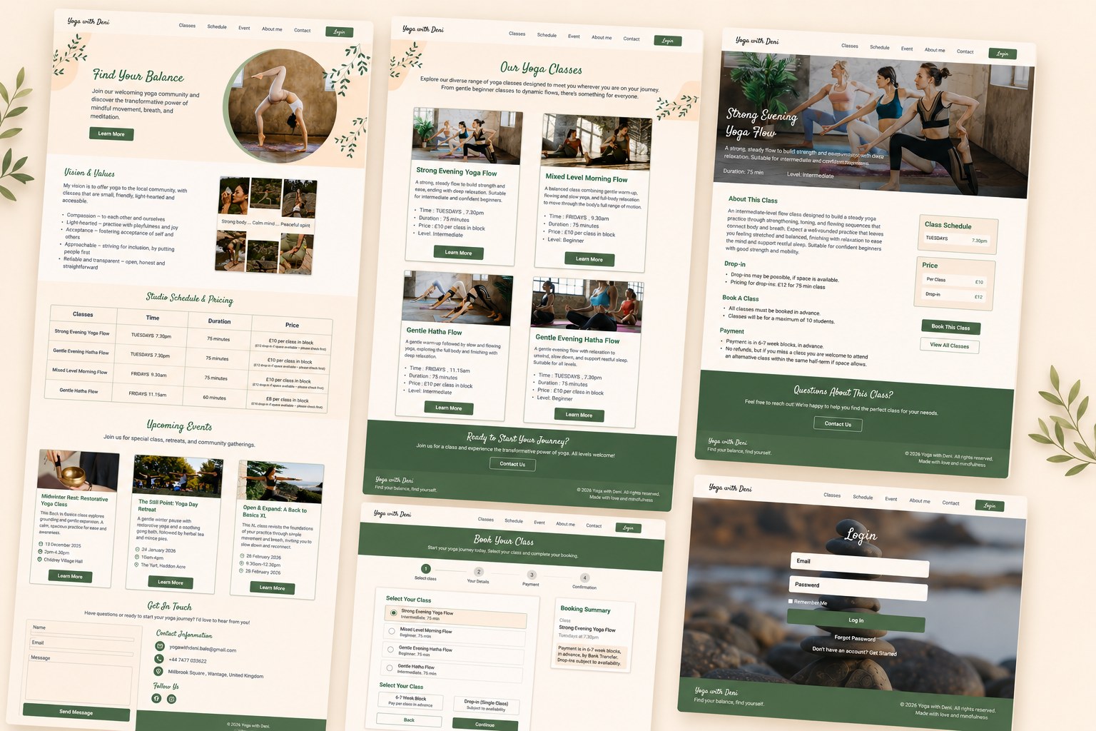
Redesigning a small yoga studio's website so first-time visitors can find, choose, and book a class with confidence.
Small studio websites often lose people right at the point of booking. Buried details and unclear next steps turn interest into hesitation. Our research found the exact moment it happened here, and that finding shaped the entire redesign.
View prototypeRole
Product Designer
Duration
6 weeks
Team
4 designers
Tools
Figma · Miro · Marvel · Google Forms · Canva
Responsibilities
UX Research · Information Architecture · Interaction Design · Prototyping · User Testing
Result & Impact
The final design is separated from the original site by 19 testing sessions across three rounds: 4 participants on the first prototype, 7 on the second, and a final Maze validation with 8, measuring task completion against the original site. I ran the final round myself, and it confirmed the two fixes that mattered most: moving the booking confirmation after payment, and raising the contrast between cards and background. The numbers below are the before and after.
- Made class details, including time, level, and price, visible directly on each class card
- Simplified navigation labels and menu structure so users could find what they needed without trial and error
- Structured the booking flow into clear steps, ending with a confirmation after payment
- Strengthened visual hierarchy and contrast so pages could be scanned quickly
- Reduced content overload by surfacing only the most essential information on each page
The Problem
User research uncovered key pain points. The most critical:
- Navigation was unclear, leading to misclicks and trial-and-error before users found what they needed
- Class details like time, level, and price were buried, forcing users to click into multiple pages just to compare options
- The booking flow had no clear structure, leaving users unsure whether the booking had actually gone through
Discover
To understand why users struggled, we combined three research methods: 15 user interviews and observation sessions, a heuristic evaluation of the original site, and a competitive analysis of four yoga platforms. All three pointed to the same root cause. Class details like time, level, and price were buried, and unclear navigation forced users into trial and error.
One priority came out of this research: put time, level, and price directly on each class card, right where users are already looking. It became the foundation of the new design.
The site didn't have a feature problem. It had a findability problem. Adding more would have made it worse, not better.
We ran 15 sessions combining interviews and live observation: first asking users about their goals and past frustrations, then watching them attempt real tasks on the existing site, finding a class, comparing options, starting a booking.
Key findings:
- Users struggled to quickly find class details such as time, level, and duration
- Misclicks and trial and error were common because the navigation and menu structure gave no clear signal of where things lived
- Missing context, like instructor information, made users hesitant to commit to a class
We ran the original site against established usability principles. The evaluation confirmed the problems weren't just visual, they were structural. The most critical issue was a complete lack of information hierarchy, which made every task harder than it needed to be.
- 1
- 2
- 3
- 4
- 5
We reviewed several yoga and wellness websites, focusing on navigation, visual design, content clarity, and key functional elements.
Compared to these platforms, the original site was missing what competitors handled well: visible class schedules, pricing transparency, and clear navigation. We closed those specific gaps, visible pricing, a simpler menu, calmer content, since clearer presentation does the same job with less effort for the user.
What I found most valuable was that smaller competitors succeeded not by adding features, but by presenting less complexity more clearly.
Define
Research pointed to a clear set of problems. To keep every decision grounded, we built the work around one representative user: Lina, who is returning to yoga after a long break, has a busy schedule, and is booking with this studio for the first time.
Lina
Our representative user
- Returning to yoga after a long break, with a busy and unpredictable weekly schedule
- Found the studio online and is booking with them for the first time
- Quickly find a class that fits her level and schedule
- Feel confident, not confused, before showing up
- Class time, level, and price visible without extra clicks
- A booking flow she can follow step by step
- Unclear navigation that leads to trial and error
- No confirmation that a booking actually went through
- Wants a calm, low-stress way to build a regular practice
- Needs to trust a site before committing her time and money
Problem and Solution Statements
- Difficult to quickly find class details (time, level, duration)
- Confusing navigation and menu structure
- Long pages with too much information and poor visual structure
- Booking flow not immediately clear
- Limited visibility of instructors and class previews
- Organize class information into clear, easy-to-scan sections
- Simplify navigation with clearly labeled menu items
- Break content into shorter, clear sections with visual hierarchy
- Implement a structured, step-by-step booking flow
- Include instructor profiles and class previews to build trust before booking
When five out of five people sort the same way independently, that's not a preference. That's the actual mental model. I built the navigation around it, not around what looked cleaner to me.
- After a period of feeling tense and out of balance, Lina began looking for a gentle way to support her wellbeing and create more calm in her routine.
- While searching online, Lina found a yoga studio site with a calm atmosphere and clear structure, and navigated straight to the Classes section.
- Lina browsed the class overview, picked one that caught her interest, and felt confident enough to continue booking thanks to clear options like “Book This Class.”
- Lina completed booking, reviewed the summary, and paid. The confirmation reassured her, and she returned to browse future classes.
We asked users to organize website content based on their own priorities and mental models. Two patterns came up consistently: class details including time, level, price, and duration were always expected together in one place, and account content was always kept separate from browsing. These patterns directly informed the site map, bringing class information into a single section and moving account management out of the main navigation.
The new structure brings together everything about a class in one section: time, level, price, and schedule. Users can compare and book without leaving that section. Account and login moved out of the main navigation, where they had been competing for attention with the core task of finding a class. What used to take several unclear steps is now one direct path from landing on the site to confirming a booking.
Develop
We sketched the core pages on paper, then refined the design through the first two rounds of usability testing, with 4 participants and then 7. Every change between versions came from something a user did, not something we preferred.
Round one fixed the structure. Round two revealed what structure alone could not fix: users needed to feel certain, not just find their way. The final changes were all about trust.
I thought a cleaner navigation would feel better right away. In testing, some users actually slowed down. Better is not enough. A design also has to feel familiar enough to trust.
Before opening Figma, we sketched the three core pages on paper: the home page, the classes overview, and the individual class page. Working at this speed made it easy to decide what each page needed to show and how users would move between them. This structure carried through to the final design almost unchanged.
We tested the first prototype with 4 participants, asking them to find class details and complete a booking while we watched where they hesitated. All three problems pointed the same direction: the layout was fighting the content.
What testing revealed:
- 1
- 2
- 3
Scroll or click to see the full screens.
The second round, with 7 participants, tested whether the structural fixes held up. They did, but six new issues surfaced, and most shared one root: users could complete tasks without feeling sure about them. The clearest case was the confirmation screen appearing before payment, which left users wondering if their booking went through.
What testing revealed:
- 1
- 2
- 3
- 4
- 5
- 6
Scroll or click to see the full screens.
Reflection
What I Learned: Three Moments That Changed How I Think About Design
This project taught me that the most useful moments weren't when things worked, they were when they didn't. Each round of testing brought something unexpected, and those surprises shaped the final design more than the parts that went smoothly.
- I did not expect five people to independently organize content the same way. That agreement gave me more confidence in a structural decision than any amount of internal debate could have. Strong patterns in user behavior are worth more than strong opinions in a design review.
- Some problems I thought were about navigation turned out to be about how the text looked. Things like font size and spacing made a bigger difference to how fast people completed tasks than I expected. I learned to look at how something reads before trying to fix how it is organized.
- Several design choices that made complete sense to me confused users during testing. That was a good reminder to stay open and let what users do guide the decisions, not just what feels right when you are designing.
Future Step
The redesign covered the core experience of finding and booking a class. There are a few natural next steps I would want to explore to make it feel more complete.
- I would like to design a section where returning users can see their past bookings, manage upcoming classes, and cancel without having to email the studio. Right now that journey does not exist in the design and it is something real users would need.
- I would add a short review or rating flow after a class is completed. That would give new users more confidence when choosing a class and help Deni understand which classes are most enjoyed.
- I would want to test with users who book classes regularly over several weeks, not just once in a study session. Seeing how their behavior changes over time, whether they get faster, more confident, or start to hit new friction points, would point to the next set of things worth improving.