TripTogether
Planning Together
A mobile app for planning trips as a group, built so the group can see what it already knows.
Most trips are planned by a group, but the tools for planning one are built for a single person. The gap appears the moment links and opinions land in a chat, where a decision and a passing comment look identical. Watching six friends plan a real trip to Ireland showed they never lacked information or the ability to act on it. What they lost was sight of what the group already knew, which makes this a problem of visibility rather than capability. AI fell along the same line. People wanted it to answer what could be verified, and to stay out of what they enjoyed deciding themselves.
Try the live appRole
Product Designer
Duration
5 months
Team
Solo
Tools
Figma · FigJam · Canva · React · Claude Code · Google Forms
Responsibilities
UX Research · Information Architecture · AI Interaction Design · Prototyping · Usability Testing
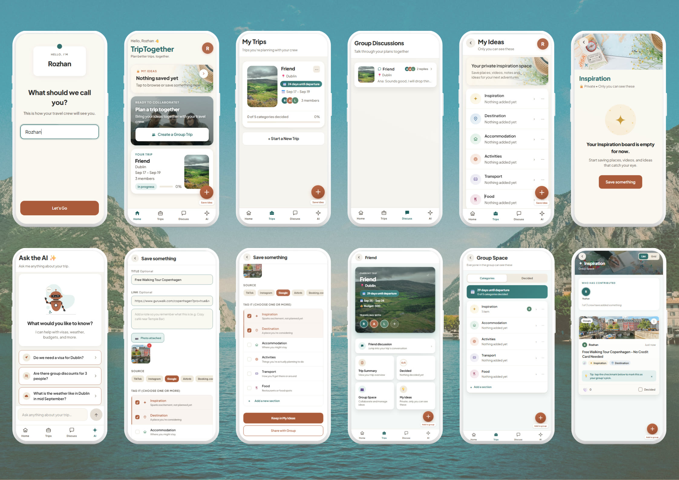
Result & Impact
The design was tested across three rounds, three people in the first, two in the second, and seven in the last. Everything below comes from that final round, testing the finished version. Each person was tested on their own, following a planning scenario I gave them and thinking out loud as they worked through the app. All four had planned a group trip recently, so they were comparing it against an experience still fresh in their minds.
- A private space where each person gathers ideas first and shares them only when they are ready, so material that is still forming is not lost to the group
- A shared space the group organises itself, starting from six categories, inspiration, destination, accommodation, activities, transport, and food, which any member can rename, add to, or remove
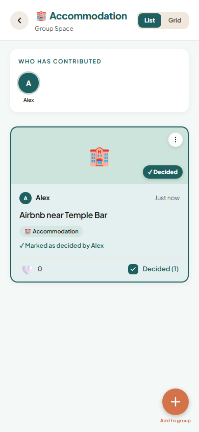
- A Decided view that gathers everything the group has agreed on, and a Trip Summary that shows the plan as a whole, including which categories are still undecided
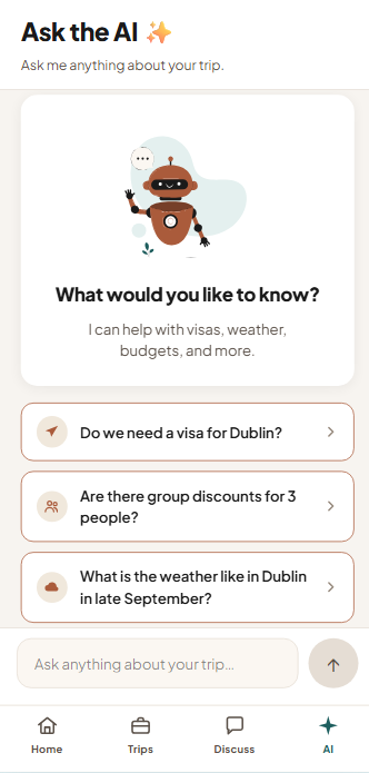
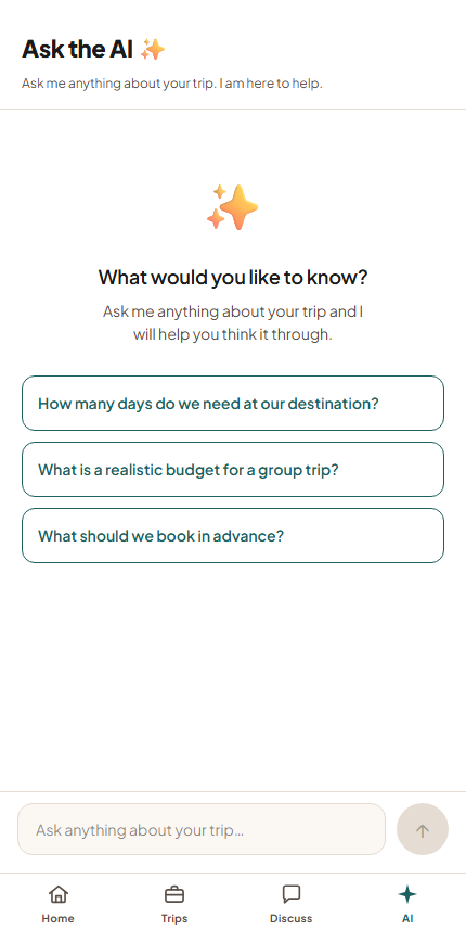
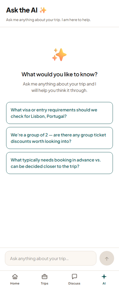
- An assistant that answers anything the group asks, but only suggests questions with an answer that can be looked up, such as visa rules, weather, or group discounts, so it stays out of the choices people would rather make themselves
- The app marks which categories are still empty and shows who has added something, never who has not, so a gap reads as work left to do rather than someone's fault
- A progress bar that moves only when the group agrees on something, so it measures decisions made rather than items saved
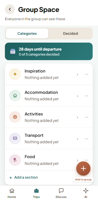
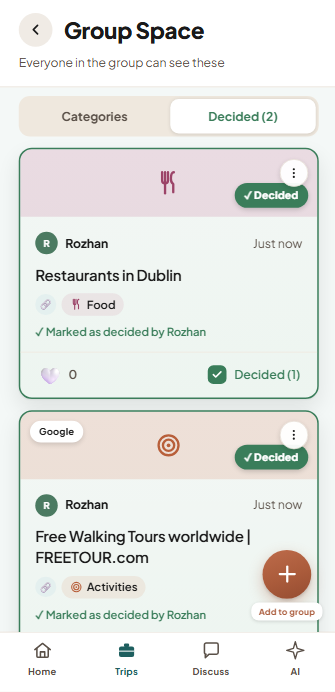
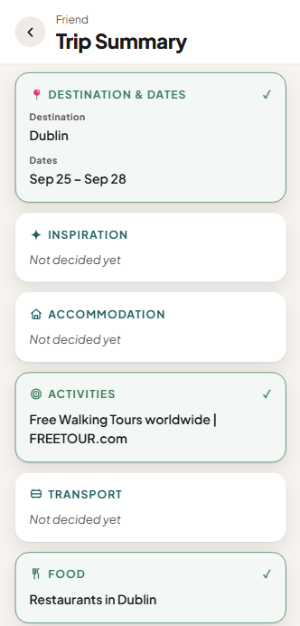
Group Space with the categories, the Decided view, the Trip Summary, and Ask the AI.
Understanding
Everyone understood the split between private and shared space without any explanation, and found what they had saved where they expected it to be. Nobody asked what a category was for or where something had gone.
Guidance
The categories did more than store things. People described them as helping them think, suggesting what a trip involves before they had worked it out themselves. One said a blank page would have been less inspiring, another said the app gave her freedom while still guiding her.
Acceptance
Acceptance depended on the job, not on the technology. Someone who would not trust the assistant to suggest where to go was glad to let it check a visa rule. It was not about how capable the AI was, it was about which decisions people wanted to keep for themselves.
Nobody needed the problem explained to them. They had already lived it.
The Problem
A survey, two observation sessions with a group planning a real trip, and a review of six travel platforms all pointed to the same breakdowns. The most critical:
- Constraints are known but never recorded, so a group keeps rediscovering its own limits. Several members needed a visa from the start, and the restriction had to be raised again every time it mattered
- A chat keeps everything but organises nothing, so a decision cannot be told apart from a suggestion. The group scrolled back through weeks of messages to work out what had been agreed
- Effort is never shared evenly, and nobody can see it happening. Six agreed to look for places to stay, two did, and the gap showed only once the place they wanted was booked
- Sharing is all or nothing, so an idea that is not ready to be shown is never shared at all. One survey respondent saved places for a trip with her partner and kept them private, to protect the surprise
- Every tool is built for one person planning alone, so the group part is left to a chat. Across six platforms reviewed, not one helped a group agree on anything
Nobody lacked the information, or the ability to act on it. What the group lacked was a way to see it.
Discover
I ran a survey with eight travellers about their most recent group trip, then joined a group of six friends planning a real trip to Ireland for two observation sessions, taking part as one of the group. Their planning carried on in the group chat between the two sessions, so that became part of the research too. Alongside this I reviewed six travel platforms by using each one to plan a trip from scratch.
Finding things was never the hard part. In a single evening the group used TikTok, Instagram, Google, a travel blog, and Google Flights. What none of those could do was hold what they had found in one place, or show what the group had already agreed.
Most of these tools are built to help one person plan faster. What this group needed was a way to see what they already had.
The survey asked eight people about their most recent group trip: who they planned it with, what they used to keep track of it, and where it became difficult. The trips ranged from two people to six, planned with partners, family, or friends.
Key findings:
- Every group planned in a messaging app and kept the details somewhere else, and that second place never held. One saved links in a notes file that could not take video, which was where most of their ideas were coming from
- Chat was the easiest place to plan and the hardest place to finish. It kept every message, but never produced a version of the plan the group could point to
- Privacy was described as helping collaboration rather than blocking it. One respondent liked that her partner could not see everything she had saved, because some of it was meant to be a surprise, and she was still planning the trip with him
- One respondent used ChatGPT for a first plan and found it quick but generic. Another wanted help turning the Instagram posts she had already saved into something organised, rather than help deciding where to go
- Effort was rarely shared evenly. Several described one person planning while the others waited to be told, and one said plainly that each person should carry their own share
The observation ran across two sessions several weeks apart, and the group kept planning in their chat the whole time, so those messages were part of what I studied. The findings below come from all of it together. The survey had described planning as an orderly sequence, from the first idea to a destination and then to dates. The group worked the other way round, and the plan took shape while they browsed rather than before.
Key findings:
- Planning started with availability, not a destination. Work schedules, graduation dates, and cheaper weekday flights had fixed four days in June before anyone said where they wanted to go
- Constraints came next and cut the options down before anyone talked about what they wanted. Visas ruled out everywhere outside the Schengen area, an expected heatwave ruled out Italy and Spain, and student budgets ruled out Denmark
- Preferences formed while browsing rather than before it. The group did not know what they wanted from Ireland at the start, and highland cows, a flea market, and a walking tour became things they wanted only after someone found them
- Everything happened on phones, and a phone shows one person at a time. Sharing meant reading a screen aloud or handing it over, so whoever held it decided what the group saw
- Six people agreed to look for accommodation and two did, so the group chose from a far smaller set than it could have. One place they liked was booked by someone else while they were still deciding
- AI never came up once. When I offered to hand their material to ChatGPT for a plan, they turned it down, because searching was the part they enjoyed
In every case the group already had what it needed. What it did not have was a way to see it together.
I reviewed ChatGPT, Trip.com AI Trip Planner, Wanderlog, Roadtrippers, TripAdvisor, and Google Travel by planning a trip in each the way the observed group had, starting with no destination and working through to travel and accommodation. Each was judged on whether it can be used before a destination and dates are set, whether several people can contribute to the same plan, whether AI output can be edited in place or only regenerated, and whether it works properly on a phone.
Every platform runs on a phone, and that was the only requirement all six met. None of them let a group contribute to, discuss, and revise the same plan while it was still being formed. The opening was not a missing feature. It was a missing shared view.
Define
I brought the survey, the observation sessions, and the platform review together in an affinity diagram. Nine themes came out of it, but they were not the same kind of thing. Five of them were about specific decisions, where to go, where to stay, what to do, when to travel, and where ideas come from. The other four were difficulties that appeared again and again inside all of those decisions.
Make what the group already knows visible to everyone in it, without taking the planning away from them.
The same four problems appeared no matter what the group was deciding. The answer was not a better way to choose a hotel. It was a better view of what the group already had.
Each theme was written up with a problem statement, a set of how might we questions, and a design direction. Looking across them, availability, destination, accommodation, inspiration, and activity are stages of one process rather than separate problems. The same four difficulties appeared at every stage, and those four were worth designing for.
The four themes:
- Constraints: limits like visas, budgets, and dates are known from the start but never recorded, so the group keeps rediscovering them
- Disorganised information: everything the group collects lands inside a conversation, where a decision looks identical to a suggestion
- Disengagement: effort is uneven and nobody can see it, so the group only finds out when the choice has already narrowed or an option has gone
- Privacy: there is nothing between keeping an idea to yourself and showing it to everyone, so ideas that are not ready often stay hidden for good
The questions were written to stay open rather than describe a feature, so the answers could come out of testing. That mattered most for AI. The research had shown both resistance to it and real interest in it, so its role was left as something to find out rather than something to decide in advance.
How might we questions:
- How might we help groups collect everything they find in one shared space, so nothing gets lost across apps?
- How might we help groups surface practical limits like visas, budget, and weather before they start planning?
- How might we help people save and organise their own finds privately before deciding what to share?
- How might we help groups divide the planning fairly, so one person does not end up carrying it?
Design directions:
- Let groups record constraints as they come up, so a visa requirement or a budget limit is visible to everyone instead of surfacing after an option has already been dropped
- Keep what the group collects in a shared space organised by category, instead of scattered through the conversation
- Make each person's contributions visible, so the group can see who has taken part
- Let people keep material private until they decide it is ready to share
Two things had to be held in balance. People search better on their own but decide better together, so the design needed to support both and the move between them. And planning everything in advance is not the same as planning well. This group left most of their days open on purpose, and booked only what genuinely had to be booked ahead.
Develop
By this point, the research had produced four design directions, and turning them into an app meant working in order. First a written scenario, to see how those directions would behave across a real week of planning. Then a set of visual rules, so the design would hold together as it changed. From there came a working prototype, a round of testing, a rebuild shaped by what that testing showed, and a second round to find out whether the changes had worked.
I built it as a working app in React, so people could use it rather than click through fixed screens. What I needed to learn was how people would behave over time, not whether they could find a button. Would someone keep an idea private when the choice appears at the moment of saving? Would the group notice a missing contribution before it cost them an option?
The role of AI was left undecided on purpose. It was the one thing I wanted testing to answer rather than my own assumption.
Six friends have four days in Dublin and one week to plan it. The scenario follows Sara deciding what to keep private and what to share, Mia adding straight away while two others add nothing at all, and Tom sharing a plan generated by ChatGPT.
Two things the scenario settled:
- The choice between keeping something private and sharing it belongs at the moment of saving, not earlier. Sara only knew the café was worth sharing when she looked at it again the next day
- Contributions should be visible inside each category rather than on a separate summary page. The group only noticed what was missing at the moment it sat down to compare accommodation
Four colours, one typeface, and a fixed set of spacing values. Together they made it possible to rebuild the app twice without having to redesign it each time.
Colour
Teal
#1E5F5F
Identity: The wordmark, active navigation, and anything that says this is TripTogether.
Terracotta
#AA5B3B
Action: Reserved for the single most important thing to do on a screen.
Sand
#F0E8DC
Surface: Cards and backgrounds that hold content without competing with it.
Milestone
#3A7D5A
Completion: Progress and decided moments only, never routine actions.
Typography
Typeface: Plus Jakarta Sans. Weights 400 to 800.
| Style | Sample | Size | Weight | Line height | Colour | Used for |
|---|---|---|---|---|---|---|
| H1 | TripTogether | 30px | 800 | 1.05 | Teal | The wordmark in the header |
| H2 | My Trips | 24px | 800 | 1.15 | Charcoal | The title at the top of a screen |
| H3 | Friend | 16px | 600 | 1.35 | Charcoal | The name on a trip or item card |
| H4 | Accommodation | 15px | 600 | Auto | Charcoal | A category name in a list |
| Body | Save places, videos, notes and ideas | 15px | 400 | 1.5 | Charcoal | Ordinary reading text |
| Button | Save with Group | 15px | 600 | Auto | Charcoal | The label inside a button |
| Body Small | Hello Rozhan | 14px | 400 | 1.3 | Warm grey | The welcome line on the home screen |
| Subtitle | Nothing added yet | 14px | 400 | Auto | Warm grey | The status line under a category |
| Label | TAG IT | 13px | 700 | 1.35 | Warm grey | A small label above a group |
| Caption | Only you can see these | 13px | 400 | 1.4 | Warm grey | A quiet explanatory line |
| Meta | 2 replies | 13px | 400 | 1.4 | Warm grey | A time or count beside an item |
Spacing
| Used for | Value | Scale |
|---|---|---|
| Gap between a heading and its content | 10px | |
| Gap between two cards | 12px | |
| Padding inside a card | 16px | |
| Left and right screen margin | 20px | |
| Gap between sections | 28px | |
| Minimum height of an input field | 48px | |
| Minimum height of a button | 52px | |
| Height of the bottom tab bar | 64px | |
| Space left below scrolling content | 116px |
Usage rules
- ✓Use terracotta for only one main action on each screen, and its label may use the same colour
- ✓Use the green only for completion, decided items, and urgent countdowns
- ✓Use one of the three defined shadows, never a single flat one
- ✓Simplify and recolour any illustration taken from elsewhere before using it
- ✕Never use pure black or pure white for text
- ✕Never add a new colour that is nearly identical to one already in the palette
- ✕Never invent a shadow outside the three defined ones
- ✕Never use the main action colour as a background tint for a category
- ✕Never crowd an empty state illustration
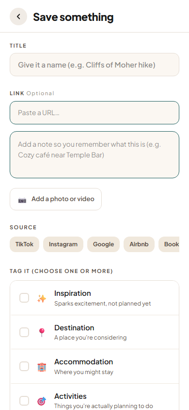
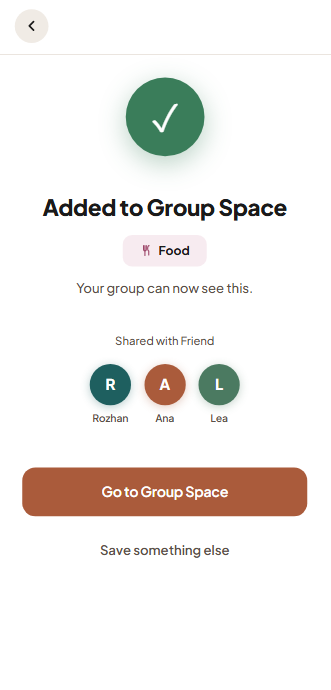
The app opens by asking for the name the group will see, then drops you into your own space, where everything you save sits in categories only you can see. You can start a group trip whenever you want, but nothing forces you to, because people collect ideas long before they agree to travel anywhere. Saving accepts a link, a note, an image, or a video, but only one kind at a time, and the choice between keeping something and sharing it comes at the end, followed by a screen naming exactly who will be able to see it. Inside a trip, the private and shared spaces are kept visibly apart, with a lock icon on the private one and a different background colour behind each. Every category shows who has contributed and who the group is still waiting on, and the assistant sits in its own tab with three suggested questions.
Not everything from the research made it into this version. Showing who had contributed stayed a simple marker inside each category rather than becoming a feature of its own. And the idea of asking a group to record its limits before searching was not built at all, because there is nowhere to record them until a shared space exists. The other five members were simulated, so one person could work through the whole group flow alone.
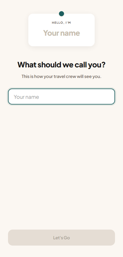
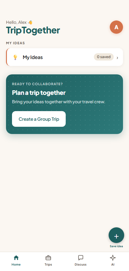
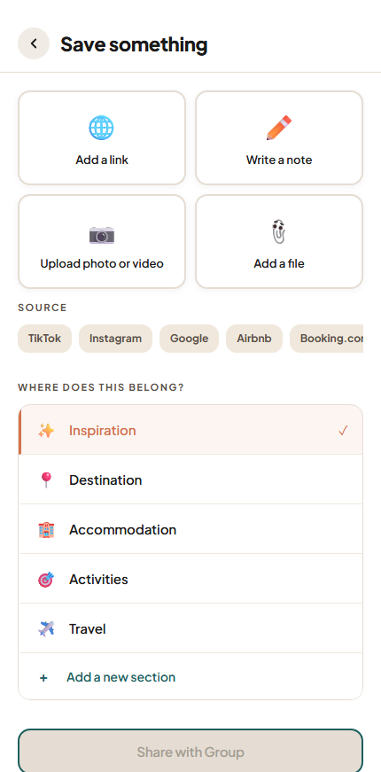
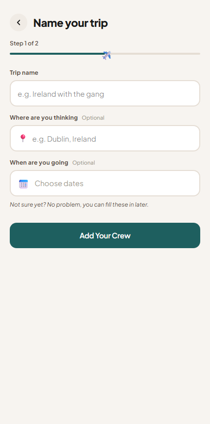
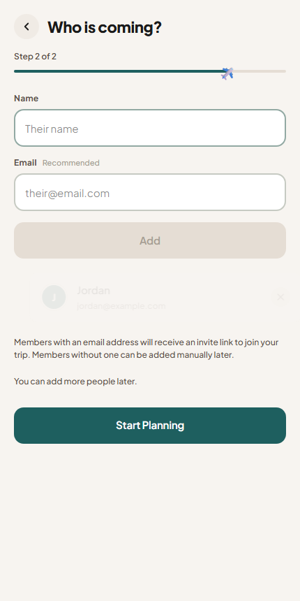
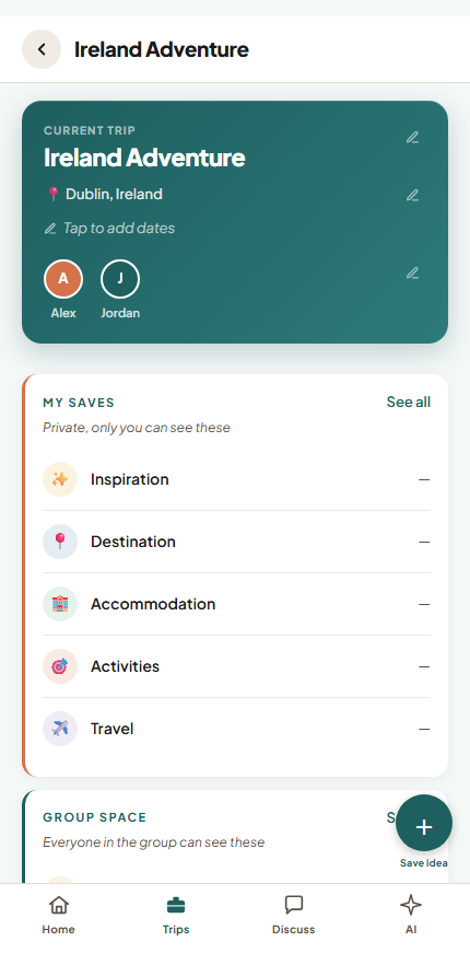
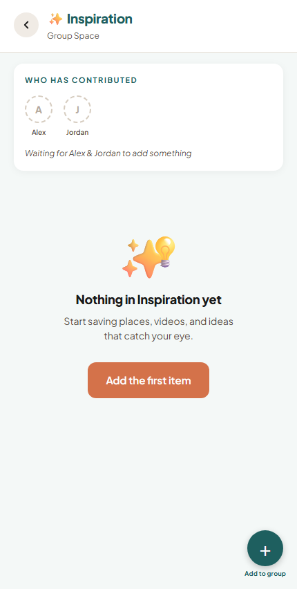
All three took part in the same session and worked through the scenario together, since the app is built for a group and their disagreements were part of what I wanted to see. They set up a profile, saved something without sharing it, created a trip, shared the item, and looked for where the group would discuss accommodation.
- 1
- 2
- 3
- 4
- 5
- 6
- 7
Saving changed the most. A title, a link, a note, and a photo now go into one entry together, so a saved link comes with a name and a description instead of only a web address. Items can sit in more than one category, and the categories themselves can be renamed, added to, or removed, so a group can shape them around its own trip. Food was added and travel was renamed transport. The private space moved below the group's and gained a lock, so it is obvious which one you are looking at.
Conversation was brought together rather than adjusted. Comments on individual items were removed, and everything now happens in a single discussion per trip, named after the trip, because with two places to talk nobody could remember which one a conversation had happened in. The assistant was narrowed rather than removed, since the objection had been to what it was deciding rather than to its existence. It now answers practical questions using what the group has already entered, and says when it does not have enough information instead of guessing.
The last change was one nobody had asked for. The first version could not tell a suggestion apart from a settled decision, so items could now be marked as decided, showing who decided, alongside a countdown to departure and a progress line for each category.
In the first round the three participants explained the interface to each other, so it was hard to tell what the design was saying on its own. The second round was run individually for that reason, with one person who had used the first version and one who had never seen it.
- 1
- 2
- 3
- 4
- 5
- 6
- 7
- 8
Reflection
What I Learned: Why Making Something Visible Is Not Enough
Following a real group, then building something for them and putting it in front of people, taught me things I could not have read anywhere.
- Visibility is not enough on its own. Making something visible only helps if it can also be understood. The decided marker showed a state clearly and still failed, because it never said what that state meant
- Structure can help people think, not only organise. Participants said the categories reminded them what a trip involves, and that a blank page would have been harder to start from
- People judge AI by the job, not by the technology. The same person refused it for one task and welcomed it for another, and her reasoning never changed. What decided it was which choices she wanted to keep for herself
- A solution needs testing as much as a problem does. I designed the decided marker from my own reading of a finding and put it straight into the next build. A rough sketch shown to one person would have caught the misunderstanding before anything was built
- Watching people plan showed me things asking them never would. In the survey people described what they remembered, which was tidier than what actually happened. Sitting with the group, I saw the same visa question come back again and again, and I saw two of six quietly not do what everyone had agreed
Future Step
- Build the collaborative side for real. The other group members were simulated, so the part of the design that matters most has never been used by an actual group. With real accounts and a shared discussion, it would finally be possible to see whether showing who has contributed encourages people to join in, or makes them uncomfortable
- Decide what happens when a trip ends. A trip currently has a beginning and no end. One participant asked whether finished trips are kept along with everything saved for them, and another wanted a final page she could export and share
- Test with a different kind of group. This was one group of friends planning one trip. Family trips often have a single person leading the decisions, which is a different arrangement and may need a different design